Student Project: SFO Report An Annual Sustainability Report done for the San Francisco International Airport. The layout of it's 180 pages are based on the unique architecture and colors of the airport as well as utilizing the right side pages as a flip book.

Cover

Binding

Back

Table of Contents

Chapter Opener

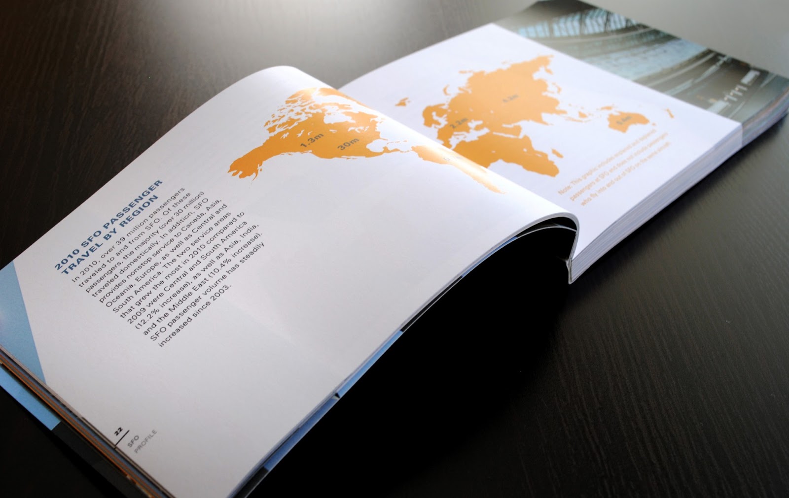
Graph Example

Graph Example

Appendix
Renewable Energy Source Posters A series of five posters showcasing the five main sources of renewable energy. The goal of these posters is to educate the viewer about how energy is collected and transformed into electricity in a way that is simple to understand. Nowadays we see a return to communicating through image instead of the written word. Ideas and concepts are most easily understood this way and these posters take advantage of that trend in that the whole process is explained through image, step by step, in a modern and designed manner. If there is doubt, the posters also include a small written part on the bottom explaining each step.
Fictional client: McGraw-Hill.
Fictional client: McGraw-Hill.
Size: 10inx16in

Geothermal

Wind

Biomass

Hydroelectric

Solar
Identity Project: sustainable+ A fictional sustainability consultant for graphic designers, design studios and printers. Their main goal is to teach designers how to think of design solutions in a more sustainable way. Part of their strategy is to show designers how to make smart decisions about the design itself, making sure its the most effective solution for the client and project. If a design solution truly works in an appropriate medium, then their is no need to make extra unnecessary promotional materials (like thousands of pamphlets or flyers). They also show what materials or processes minimize waste, chemicals and promote recycled options. They want to help the client make an easier transition into “going green”.
Since this business emphasizes upon the “green” sustainability movement, its identity should reflect its goals. They use soy ink on 100% recycled post consumer waste for all the printed material used to promote the company. They also use less harmful methods like die-cuts and embossing to minimize paper or chemical waste. They understand that technology has taken a great role in society and use it to their advantage to promote their goal via their website and widget.
Logo The name sustainable+ refers to being “more than sustainable”. They advocate the motto “design for change”, designing efficiently and consciously to benefit the environment.
Tagline The tagline uses a thin Avenir. Once again, it refers to how sustainability is more than “being green” or looking green.
Visit Website
Visit Website

Logo

Deliverables
No comments:
Post a Comment